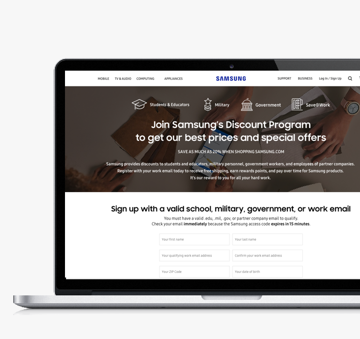
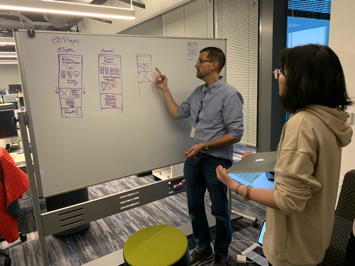
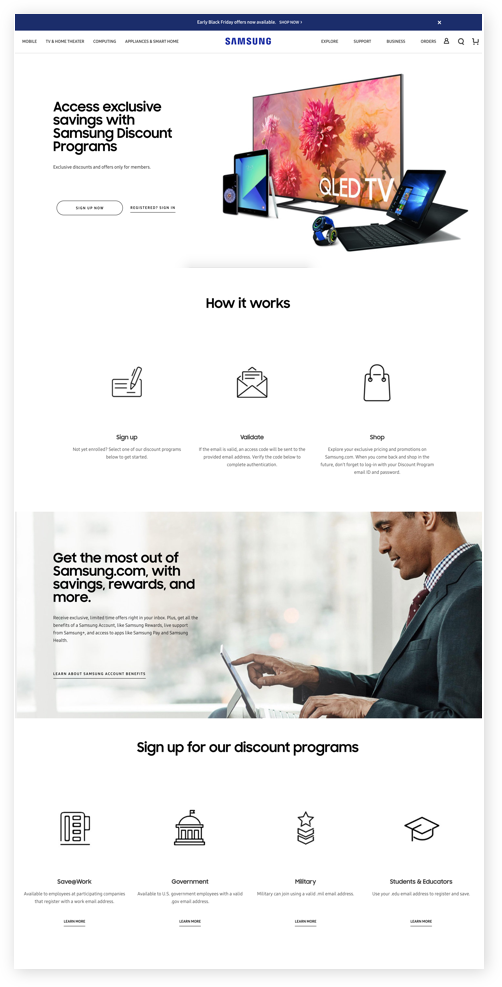
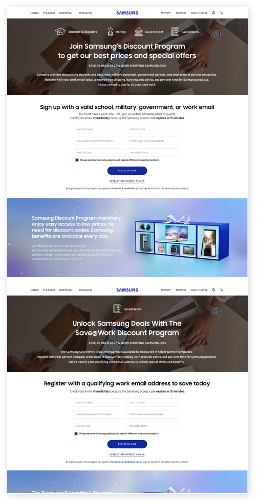
Samsung Employee Discount Program offers Samsung products at a discounted price to some selected partners (like students, military, government, doctors and employees). The goal for this project is improving the experience for both new and existing customers. After fully audited the current site, we came up with a new UX roadmap, which contains the short-term fix and long-term solutions. And I designed the 2.0 version visuals individually.
Authorized email address, authorized email domain
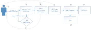
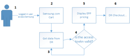
Logged in User accessing Discount Program Store
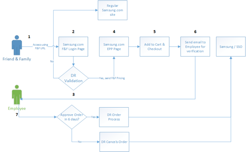
Friends/Family
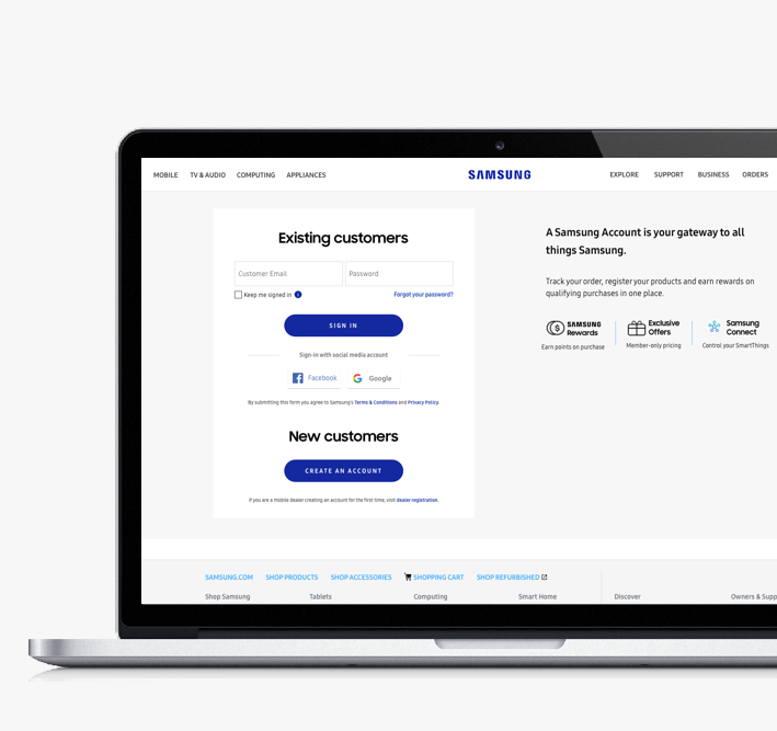
When a customer lands on the EPP page, it is a confusing to know where to sign-up. 1. Confusing Log-Ins. 2. Copy is misleading. 3. Image does no communicate much and can be distracting. 4. Insignificant information. 5. User journey is inconsistent.
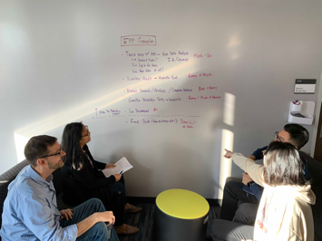
Most of the information is confidential, so I can’t reveal too much what I did for the team. But I can tell this; overall this project is very interesting and exciting! Every day I’m deep diving UX and learning how to apply them to website visual experience. I can't wait to see how far this program can go for it's 3.0.